Tech
Jul 6, 2023
An overview of the multi-page scrollable bottom sheet UI design
We are excited to introduce WoltModalSheet, an open-source package designed to revolutionize the use of Flutter modal sheets. Built with Wolt-grade design quality and used extensively in Wolt products, this UI component offers a visually appealing and user-friendly modal sheet with multiple pages, motion animation for page transitions, and scrollable content within each page.
Here is a summary of the features offered by the WoltModalSheet package:
Responsive Design | WoltModalSheet is designed to adapt to different screen sizes. It can be presented as a dialog on larger screens and as a bottom sheet on smaller ones. |
Multiple page functionality | The modal sheet isn't limited to a single page. You can incorporate as many pages as you need, offering users an intuitive, step-by-step flow without leaving the sheet's context. |
Motion Animation | Motion is a key feature of the WoltModalSheet. Animated page transitions and page scrolling make the user experience smoother and more engaging. |
Scrollable Content | Each page within the modal sheet is scrollable in case the content doesn’t fit in the available space. |
Customizable Appearance | The library provides options to customize the appearance of the modal, allowing developers to tailor it to fit their application's branding and design. |
Dynamic pagination | The modal sheet page list can be dynamically set according to the user input on each page. |
Imperative and declarative navigation | The library provides examples of both imperative and declarative navigation patterns for displaying the modal sheet |
State management | An example project demonstrates the usage of popular state management libraries integrated to the modal sheet pages. |
Open Source | The library is open source, allowing developers to contribute to the development of the library, fix issues, or suggest new features. |
In this multi-part blog post series, we aim to provide you with an in-depth look into the thoughtful design process and the development details that led to the creation of this versatile UI component.
In today's post, we'll be delving into the first part of this journey, exploring the foundational design decisions that guide the WoltModalSheet's functionality. To keep things simple, we'll focus on how we designed the bottom sheet. Keep in mind that we used a similar approach for designing dialog sheets.
So, let's get started on this journey of design and development.
Part 1 - Designing a versatile bottom sheet
Understanding the Essence of the Multi-Page Scrollable Bottom Sheet
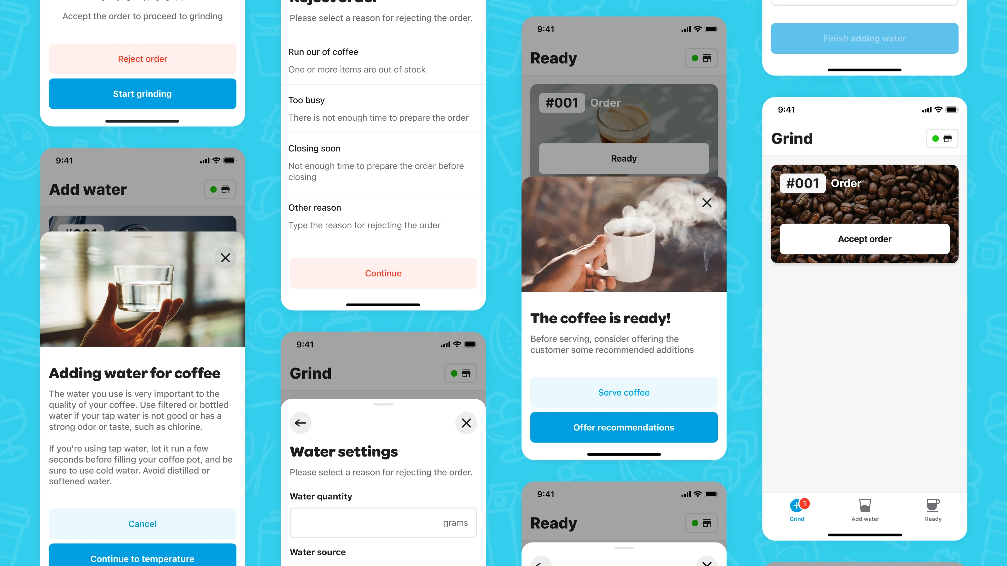
Bottom sheets in mobile apps play an instrumental role. They enable users to view information or execute a task separate from the main view while preserving the context of the task's connection to the main view. There are the moments when choices made on the sheet lead to further decisions, but the link to the main view must be preserved. For this case, we developed the multi-page scrollable bottom sheet.
Tackling Challenges and Balancing User Experience
At its core, this component is designed to offer users the flexibility to navigate through alternative flow paths within the bottom sheet. The direction they choose is dictated by their input at each step. From the user's perspective, a single flow can unfold into multiple alternative paths. As the users proceed through these steps, they remain comfortably in the familiar context, connected to the main view that initiated the sheet.
Balancing Versatility with User-Friendly Design
A component like the multi-page scrollable bottom sheet brings great possibilities. But with great opportunity also comes great responsibility. There is a delicate balance to maintain for your overall user experience to ensure users can still perform the task at hand efficiently. Be sure to consider how many steps are necessary for your user’s task, and not to overwhelm the user with many actions. If you are collecting extensive information from the user, consider whether transitioning to a new main app view might provide a more streamlined experience. And remember, bottom sheets are inherently dismissible, so plan for scenarios where the user might close the sheet, either intentionally or accidentally, after inputting information into multiple screens.
Dissecting the Bottom Sheet Components
All of the components in the sheet play a role in giving the user context, flexibility to navigate, and explicit action to perform.
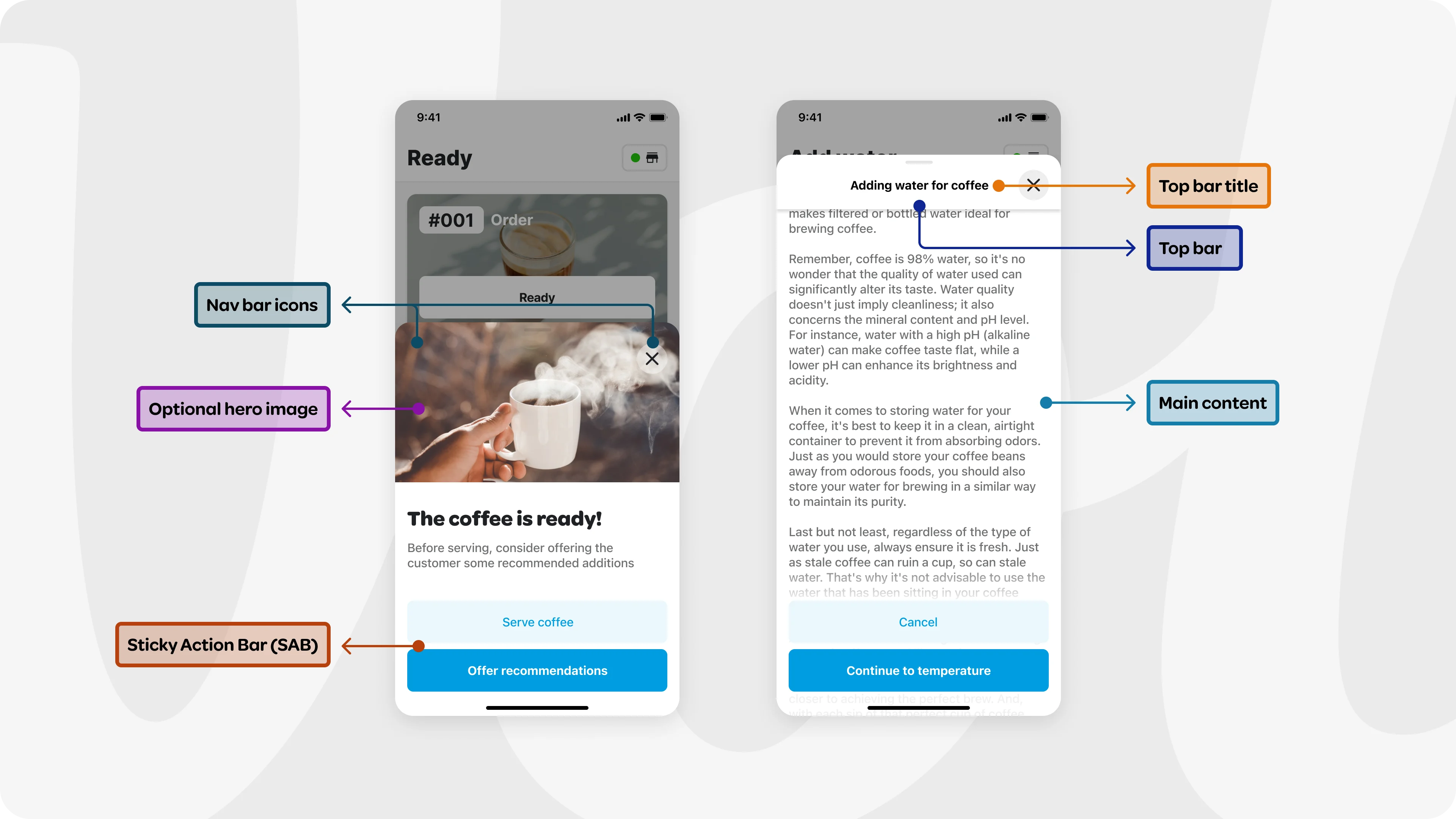
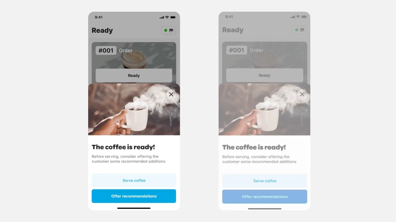
Our journey begins with the Top Bar - the anchor of the sheet. Within the top bar, there are crucial navigation actions that enable closing the sheet or navigating back to previous pages in the sheet. It also holds a top bar title that gives context to the main goal of the flow. For sheets that are required to scroll due to a longer amount of content, the top bar elevates and remains sticky, so the user always has access to these actions.
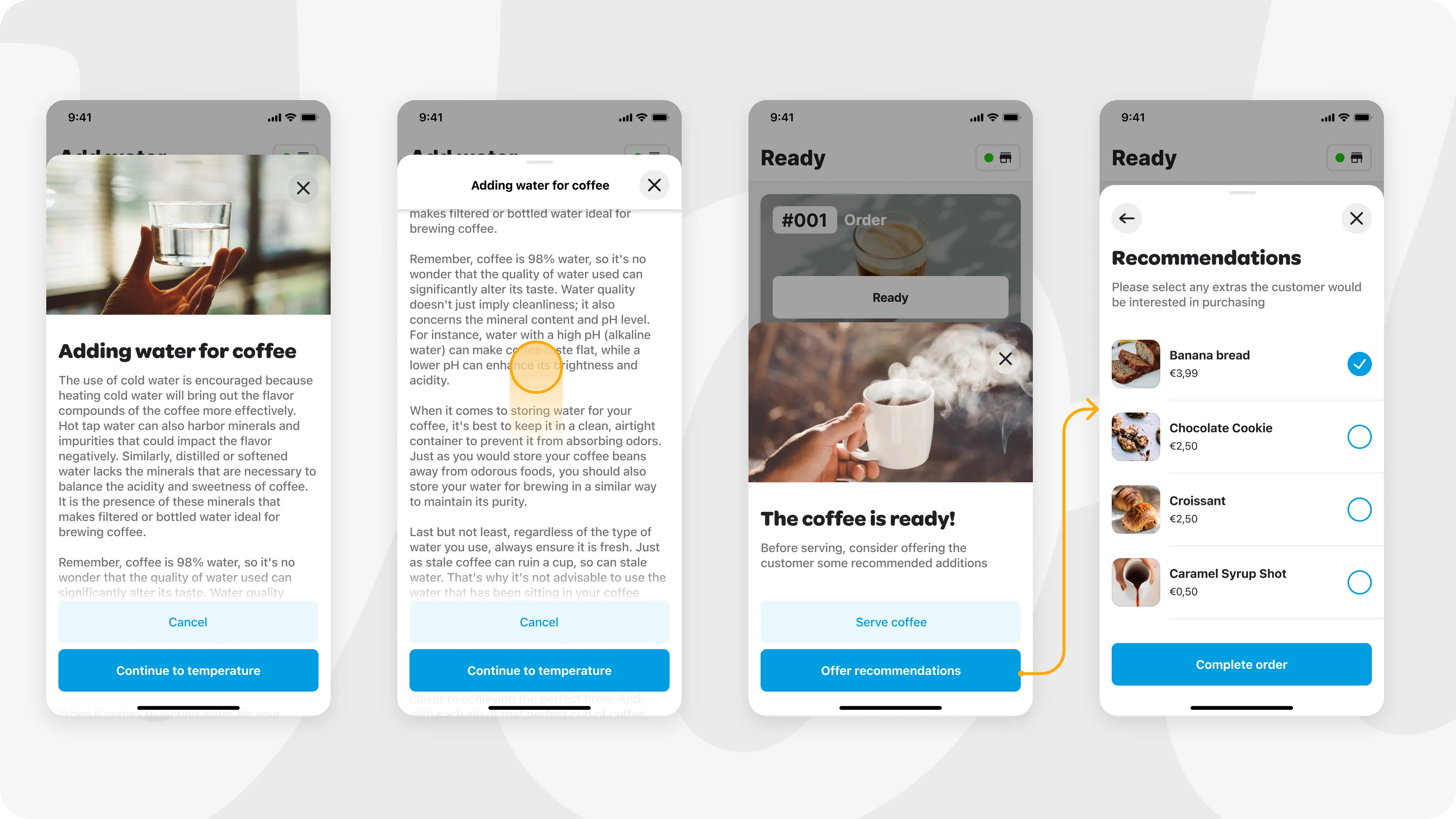
The other component is the sticky action bar (SAB). Its role is to give the user a clear next step. Fixed to the bottom of the view, the SAB elevates above longer form content with a gentle gradient. This positioning guarantees that the action remains visible, emphasizing to the user that there's more content waiting to be discovered below the fold.
An optional hero image is placed at the top of the main content. It grabs the viewer’s attention immediately and communicates the main theme or message of the content.
The optional page title above the main content helps users quickly understand what to expect from the page. It gets hidden as the user scrolls. In this case, the top bar title can be useful for the same purpose.
Part 2 - Project from the Motion perspective
Bottom sheet behaviour overview
Motion serves as a crucial agent connecting static screens. It brings clarity, reduces cognitive load, and introduces a logical, natural consistency to user flows. So, how do we approach this project from a motion perspective? Our first step is to evaluate the possible interactions users can have with the sheet, identifying what needs to be animated. The bottom sheet appears and slides back; users can also scroll the content within the bottom sheet and navigate to the next or previous step.
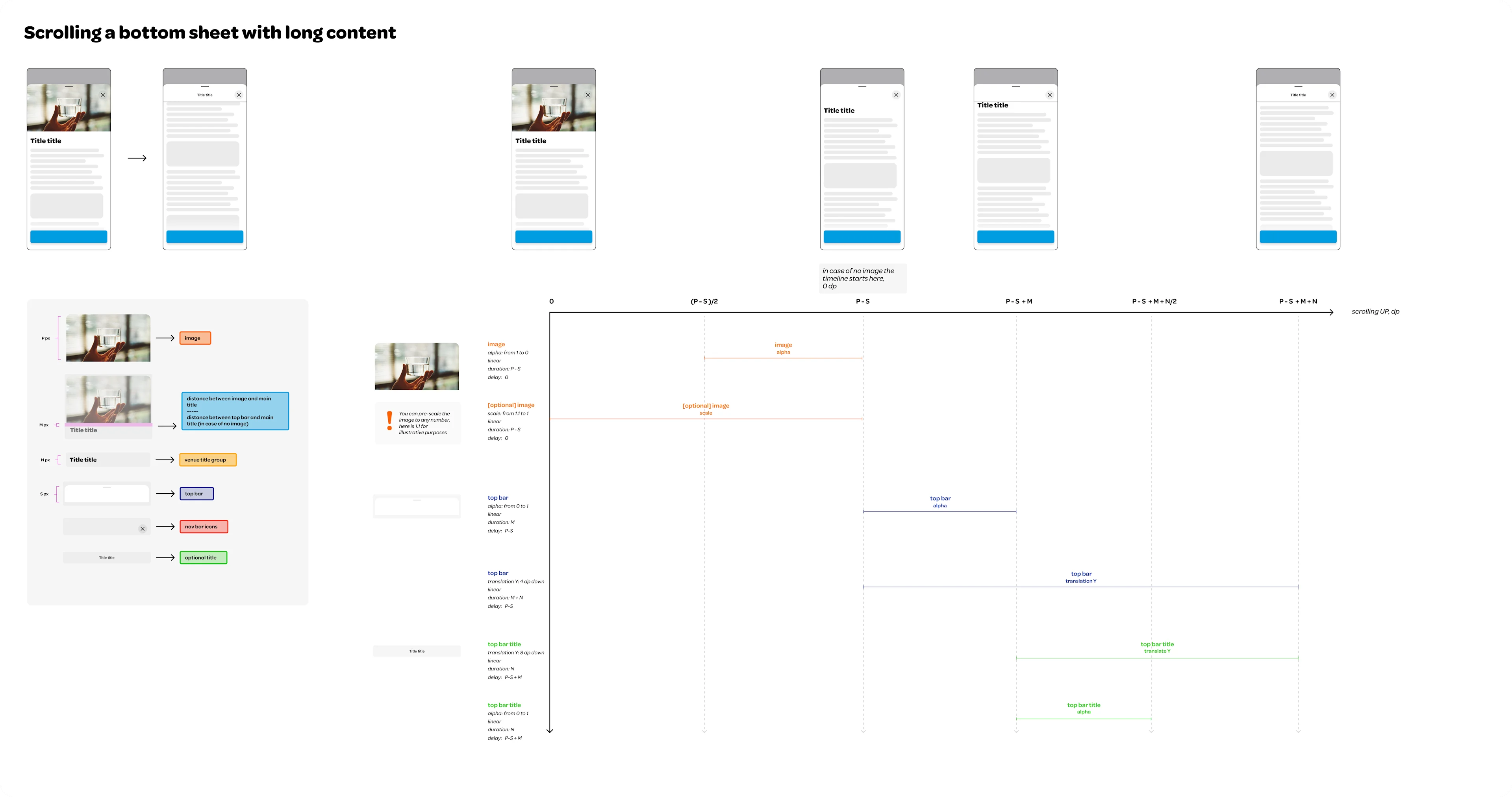
Let’s begin by discussing scrolling
When content exceeds the fold line, the user can scroll through it. When scrolling, the top bar remains visible, however it becomes elevated, and an top bar title is added when the main title becomes obscured. Thus, we need to animate the Top Bar to elevate and trigger the appearance of the top bar title. The top bar can elevate with opacity and shadow change, where crucially, the elevation should be completed by the time the content begins scrolling behind it. To ensure this, we need to measure the distance between the top bar and the first content element, using this distance as a reference for fading in the elevation.

Next, we move to animating the top bar title
By treating the main title and top bar title as the same element in different states, we maintain their connection. As such, we can begin to show the top bar title as the Main title disappears behind the bar. Think of this like two vessels connected in physics; when one weight rises, the other drops. The top bar title begins its animation (appearing) simultaneously as the Main title starts to vanish, concluding when the Main title is entirely behind the bar. Given that the Title height is variable, we designate it as N dp. We opted to 'slide' the top bar title on animate in to mirror the scrolling behaviour of the main title. We made the top bar title slide down when appearing, to echo the physical metaphor of a scrolling sheet of paper where the top bar bends and moves downward. This motion was chosen, especially considering scenarios where multiple top bar titles are present. The downward movement provides a solution for animating all of them.
Nevertheless, one can choose to slide the top Bar title up upon appearing, which would follow the scrolling direction. However, we chose alternative behavior due to other objectives.
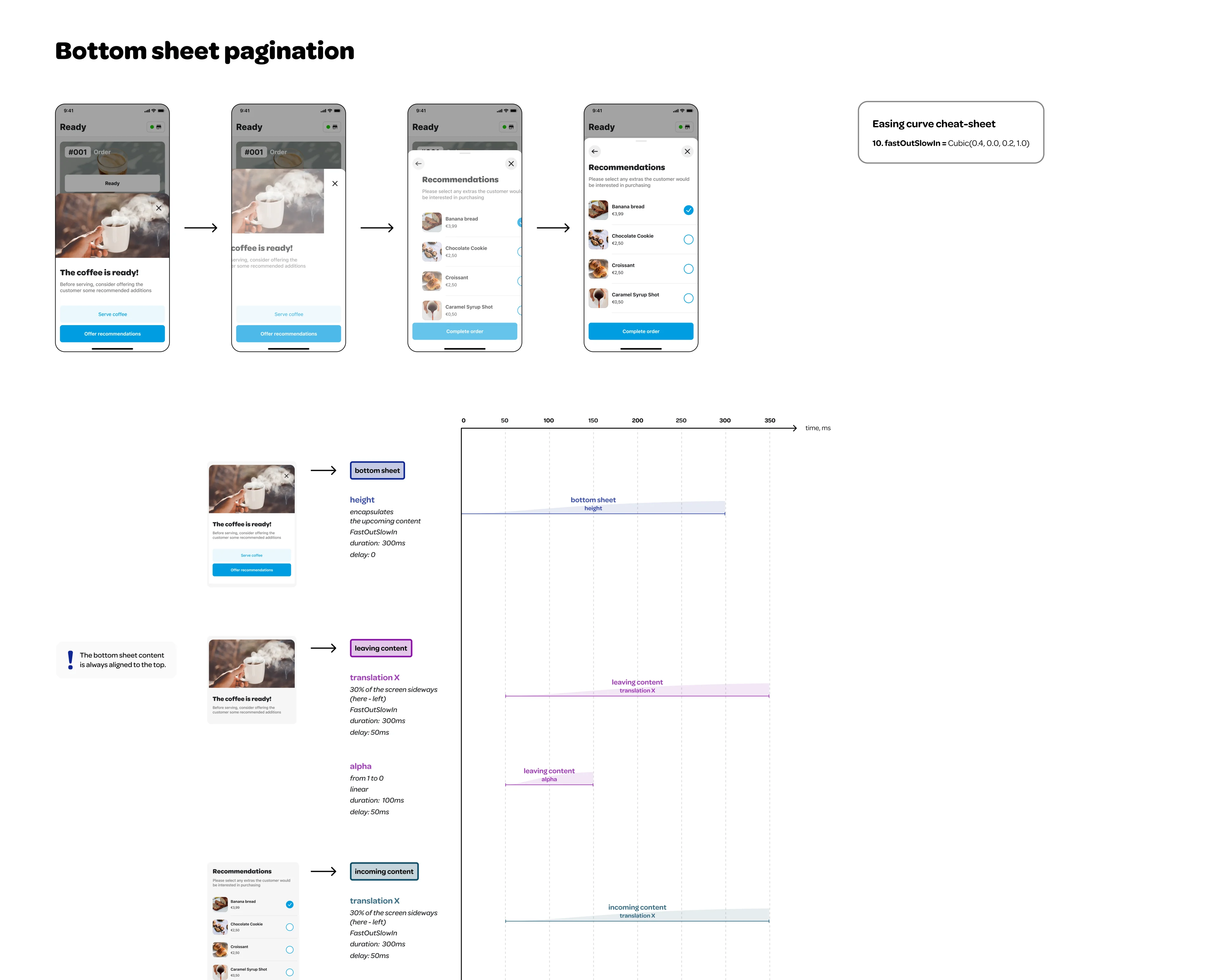
Upon finalizing the scrolling, we can transition to pagination
Pagination involves a sequence of screens the user navigates sequentially. We chose a lateral motion for these transitions. When proceeding forward, the next screen emerges from the right; moving backward, the screen reverts to its original position. We felt that sliding the next screen entirely from the right could be overly distracting. As a result, we decided to move and fade in the next page using 30% of the modal side.
We also needed to consider the variable height of each page. We developed a behavior specification that works with any potential page height. As the bottom sheet content slides laterally to the next or previous page, we also account for the height of the upcoming page and animate the bottom sheet's movement accordingly. A well-orchestrated sequence of timings and delays ensures fluid transitions.
Both Top Bar elements and Sticky action bar stay persistent during pagination transition, being only affected by opacity change.
Last step: hand-off
To facilitate communication with our engineers during the hand-off process, we create a detailed specification timeline. This timeline explains what happens and when, streamlining the coding process and eliminating guesswork related to timings. We utilize motion tokens for interpolator curves to ensure consistency in our product's movement, which further simplifies the process. The following are the specification sheets we have prepared for both interactions: scrolling and pagination.
Conclusion
The multi-page scrollable bottom sheet is a powerful component that can effectively improve the overall user experience within mobile applications. It provides the user with a highly flexible and interactive platform for executing tasks while maintaining a strong connection to the primary view. However, this component should be utilized thoughtfully, as overcomplicating the user journey can lead to confusion and diminish the user experience. It's crucial to maintain a delicate balance between providing a variety of options and maintaining a streamlined, intuitive interface. When designed and implemented correctly, its design and motion components create a seamless flow that guides users through multiple potential paths without disrupting their overall task context.
In the context of our work at Wolt, the multi-page scrollable bottom sheet isn't merely a component – it is one of the cornerstones that shape our product's user experience. Given its prevalence across various parts of our apps, it serves as a critical conduit that empowers users to seamlessly navigate through multiple paths, all the while maintaining a strong connection to the primary view.
✒️This blog post was written by: Maria Lomakina, Staff Motion Designer, Cagatay Ulusoy, Flutter Competence Lead, and Scott Lyttle, Staff Designer